For a large organisation like CAFOD, mobile transformation creates an equally large set of challenges. Digital manager Karen Toftera explains how a two-phase approach is proving successful
It is estimated that by 2017, 70% of the global population will have a mobile device, and already there are more mobile devices than there are toothbrushes in the world. When Google announced earlier this year that it would be rewarding mobile-friendly websites, it came as little surprise – yet as many as 1 in 3 UK fundraising charities failed Google’s mobile-friendly test.
In 2013, around 20% of CAFOD’s website traffic came from mobile devices; this year it was over 40%. Earlier in 2015, we made it our goal to ensure our supporters can find information and complete actions easily on any device, which meant not only making the site mobile responsive but also optimising it for all devices.
Two-phase approach
We had a strong business case for the website overhaul, and through constant internal advocacy managed to get the resources freed up to work on this important project. We knew that for our in-house digital team, managing such a big project alongside their day-to-day tasks would take time to complete, and so we broke it down into two phases.
Our aim in phase one was to make the whole site mobile responsive as quickly as possible, prioritising those changes that would have the biggest impact for the audience and the actions they we trying to achieve. We would leave all non-urgent functional and architectural changes to phase two.
The obvious place to begin phase one was with the donation pages of the website. We updated them to be mobile responsive – and analysis shows that this alone led to more than a 200% increase in conversion rate in the first month.
But there was much more to be done. Being a large, multifaceted charity, there is a lot of information to convey on our site, but it had been suffering from a lack of consistency in its internal navigation. In addition, the old web templates we had in place were not representing the CAFOD brand well. We want our supporters to feel a connection with CAFOD through the brand, and to know that a visit to our website will be interesting and rewarding. We needed a structure that would enable them to find the information they need to perform the action they want as efficiently as possible.
Getting the branding right
In addressing this, one of the first things we did was produce a set of digital brand guidelines, which are in line with the visual identity of the new site and which will be translated to other channels in the course of time. Meanwhile, the internal navigation was standardised throughout the site: everything from superhero banner buttons to body copy links had a complete overhaul.
There are many dimensions to CAFOD’s work and we cater to many different supporter groups. We therefore had to carefully think through the journey every type of supporter would want to make, and their possible goals, and tailor the calls to action and content to represent these pathways. We knew that when it came to designing our website navigation, simplicity was key; if you are crowding every page with many different and equally important asks, your supporters can quickly feel overwhelmed. So we designed just one or two calls to action at the top of each page, making the purpose of the page clear.
Better visual navigation
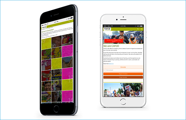
More white space gives a cleaner look and a nicer user experience. We have started to use a more visual navigation, for example on the education pages. We hope that our use of strong, bold images will help with navigation. We have made our banners more attractive, and have streamlined the asks on each page. Traffic to specific resources from the ‘Primary Schools’ page, for example, has more than doubled since the call to action was added in the banner – previously it was just in a main content widget.
The new mobile-responsive website will enable us to use more dynamic interactivity and visual storytelling on the site that will be beneficial for the supporter experience. This includes animated infographics, interactive maps and video superhero banners to highlight content and communicate key messages with accompanied actions. We will start rolling this out properly in phase two, but have already applied it to our new mobile-responsive, interactive Advent Calendar.
Structural solutions
The changes we made to the menu forced us to come up with new solutions to site structure and navigation to some pages. Looking at these issues also gave us an opportunity to reassess whether content was stored in the correct sections, whether it was still relevant and whether it was too deep in the site. The changes we implemented have already resulted in a big increase in the traffic to the pages, which were previously less visible in the menu. For example, our policy and research section has had 3 times as many visits in the time since the site went live compared to the same period the previous year.
One problem in development came in device compatibility and page speed – for example, we found that on some mobile devices the slide-out menu was slow to respond. We addressed this by implementing some custom fixes for those devices. Meanwhile, having created a series of splash images for the page headers, we found that the load times went up, initially. We combatted this using some smart loading techniques to get the load times back down. Page speed is so important for supporters on mobile devices that this was worth spending time on.
Making it easier to test
The site went live on September 8 and is now fully mobile responsive. We are now in phase two of the project, which involves revising the current architecture in order to make the site fully optimised for mobile. But with the new design, everything is also easier to test before we make any further changes.
It is still early days, but one result we saw straight away was receiving a score of 100/100 for user experience on mobiles from Google Page Insights. This month has the lowest bounce rate this year for the site in total, with significant improvement on mobile and tablet, and for new users in general. Important pages, like our new volunteering section that’s part of our fundraising strategy, have had higher traffic after the overhaul of the menu structure. Furthermore, the increase in conversion rate for our donation pages has now gone up to 320% compared to pre mobile responsive pages.
Championing the changes
This huge project has been managed by our incredibly hard-working and talented in-house team – which includes a ‘web champs’ group that was engaged when building and testing the new site, and whose members are trained in looking after specific sections of the site. The design, development and editorial changes were all done in house; we only relied on agency support for the final back end development to the CMS.
For everyone, managing the project alongside their day-to-day work was a challenge, but it was also very exciting to work in this way – and it’s wonderful to see the benefits so quickly.
Karen Toftera is digital manager at CAFOD


