Advance’s consultative approach to rebranding brought the organisation together to create a public face that service users can identify with, and funders can draw confidence from
Last year, when we began leading on a new partnership called Angelou to tackle violence against women across West London, it struck us that the brand for this partnership was stronger than our own!
The culture of the voluntary sector has changed a great deal in 15 years, and so have we – we have adapted to working in a more competitive environment, and we are negotiating more contracts both with the public and private sector. Until last month, however, our brand was out of date and didn’t accurately reflect the culture, leadership, or professionalism of the organisation.
Getting on the right radars
Implemented in 1998, our brand represented the domestic abuse element of our work, but not our work with women offenders, which we began almost ten years later. We wanted to ensure our brand and logo reflected the breadth of our services.
Furthermore, the website needed to engage and be immediately accessible to a very wide audience: service users, those who might refer them, the police, GPs, housing, and those who might want to partner with us or fund our work.
It also needed to put across a clear strong message about the importance and quality of our work, and give our service users the confidence that they have come to the right place for free, confidential, skilled support.
The right ‘look and feel’
It was important to us that the brand brought together a few critical elements. We wanted it to communicate the strength of the women who use the service and their hope and desire to change their lives. At the same time, we wanted it to look and feel welcoming and trustworthy and, recognising that a lot of our clients feel trapped or lost, give the feeling of possibility for a different sort of life.
In the new logo, the woman’s face looking forward and slightly upward aims to communicate a way forward, or a way out. Our designer at Tapestry, Chris Doherty, cleverly merged this with the bird image to represent the independence we want to support women to achieve:
.jpg)
The whole look and feel, including the new colour palette, ably communicates the combination of optimism, professionalism and trust that we were looking for.
Smart resourcing
Resourcing the rebrand was a challenge, because there wasn’t any allocation in the budget for the year. We made a compelling case to the board that ring-fencing a small amount for this project would ultimately benefit the organisation many times that: allowing us to help more women and positioning us to develop new partnerships.
We were lucky enough to have a marketing and communications specialist (Pamela Blamey) on our board who led the entire project pro bono, starting with a workshop to ensure that we considered a wide range of input from staff members and the board.
The design element was of course critical, but quality work isn’t the sole preserve of heavyweight agencies: all you need is a designer who makes the effort to understand what you want and has the commitment to deliver, and clear communication with them about what you want to achieve. From a shortlist of potential suppliers we chose a small, offshore design agency to keep costs down, and were able to communicate via conference calls, Skype and email effectively throughout.
An inclusive process
Being a consultative organisation, we set up a small working group from staff and board to work through all the decisions and changes. Doing anything consultatively takes longer, and there will be points where people disagree and someone needs to arbitrate – this did happen, but it was fairly easily resolved and totally worth it.
When people feel consulted and part of the journey it makes a huge difference to the outcome. The proof is in the unanimously positive feedback we’ve had now that the new brand and website have launched.
Timescale slip? Not a big problem
The other main challenge was simply time – our board is all voluntary and all have full-time jobs, so any work on this had to fit round that, and the already very full schedule of the CEO. The rebrand was therefore adding to already busy diaries, and it was difficult to set aside time to sit down together to look at materials. Plus, we had to be mindful that the designer had other clients as well and could not always be expected to fit to our erratic schedule during rounds of amendments, for example.
We were quite ambitious in our original timescale, and that did slip quite a bit, but in the end we realised that was actually fine. The value for money we were able to get was phenomenal and that is what really mattered.
Geared up for the future
The new website launched in January, and we are all very happy with the new brand and excited to see where it will take us. It is very early days, but people have remarked that we already feel like a different organisation. While it is too early to gauge the impact it might have on certain areas, for example, our fundraising or awareness, the feedback so far has been overwhelmingly positive.
With the charity sector under so much pressure, a strong brand isn’t simply a ‘nice thing to have’ – it’s essential, in order not only to stand out, but also to ensure that people understand what you stand for.
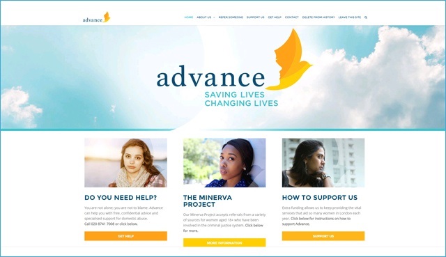
We now have a brand that truly reflects our organisation’s vital work and ethos, and a website that is clear, easy to navigate and effective, as we think this screenshot illustrates:

We are all very pleased to be associated with both the new branding and the new website. The proof will be in the service users’ and funders’ perception and awareness, but we are confident – watch this space!
Pamela Blamey is a trustee and Anna Smith is chief executive at Advance


