What do WWF, Oxfam, Amnesty International UK and Cancer Research UK all have in common? An incredible website that engages visitors from the outset. Here’s how to benchmark and improve your own website to rival the top dogs
Charities today are increasingly aware of the importance of a digital presence in communicating their cause and rallying support. Whether your charity’s website was launched last month or last year, it is important to continuously benchmark, analyse, learn and optimise so that your site is always working for you at its full potential.
You can actually perform quite a good review of your website on your own, provided you know what to look for. In this guide, we will pinpoint some of the areas worth looking at, as well as some examples of charity websites that got it right.
Your charity’s homepage
Let’s start with your homepage, the gateway to your site and the page your users are most likely to come across first (although you can expect them to land on any other page on your website via Google or referral, which is why it is important to also think about your website structure and elements that appear on every page). Try to look at your charity’s homepage through the eyes of your users, or ask a friend (ideally this would be someone who doesn’t already know your website very well) the following questions:
* Does the homepage orient the visitor? – Is it clear who the page belongs to and what business they are in?
* Does it take no more than ten seconds to understand what this organisation does from looking at their homepage?
* When visitors arrive on the homepage will the most prominent thing on the page explain this organisation quickly and inspire them to keep finding out about it?
* Is it immediately clear what you need to do on the site? Ie what action you are expected to take.
If the answer to these questions is yes – you are off to a brilliant start. If the answer is no, it is never too late to make some improvements to your homepage. The Oxfam homepage is a great example for a charity homepage that is ‘on point’.
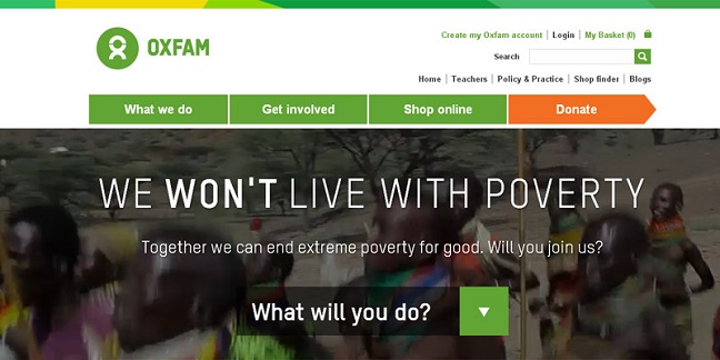
This homepage features a background video, which is quite striking and powerful. It is immediately apparent by the colours and other branding elements (logo etc) that you have reached the ‘Oxfam’ homepage. It is also immediately clear that they are tackling the issue of poverty. But what is far more important is the call to action, front and centre in large font: “What will you do?”. This is a brave approach, they are challenging their audience to do something to help, safe in the knowledge that most of their users will want to do just that. If you do want to help, you know immediately what you need to do next on the site (click on the arrow). So the user journey begins.
Your charity’s website content and layout
Does your website content meet the following criteria?
* Short, pithy headlines
* A strapline that explains and inspires
* An articulation of your goals in priority order
* A clear, simple navigation bar which directs to the most important parts of your site
* A content structure that complements your goals and informs your audience(s) of the important aspects on your site relevant to them.
Cancer Research UK is a good example. This charity features a lot of content on their site, content meant for vastly different audiences (from information on different types of cancer to how to apply for a research grant). But they have found a way to organise this information in a way that is not overwhelming. They have a good content structure and even better use of headlines. Their headlines tell a story and are uniform in their message and tone, all creating a sense of urgency “Let’s beat cancer sooner”, “donate right now” etc.

Your charity’s website imagery
* Are your images ‘on-topic’? Do your images fit in with your website’s style and with your brand?
* Are you selecting images where there is plenty of background around the subject so that they still work at different sizes?
* Are you avoiding any text or panels that float over the images in slideshows?
On using slideshows (a side note): Many charities choose to display their work in a homepage slideshow of images. While this might be an effective way to showcase their activities, it creates a challenge in terms of content updates as the images need to be reconstructed regularly as new items are added to the site. What are the rules of thumb to creating an optimal image for your website slideshow? I don’t think there is an easy answer to this question. The idea is to start with a really good big picture with an engaging(preferably human) subject near the centre, with plenty of background so the image will fit a lot of different shapes and can have text or headline panels floated over it without obscuring the subject. In other words you need a really good selection of pictures at your fingertips, so you can pick and choose what fits best in each context.
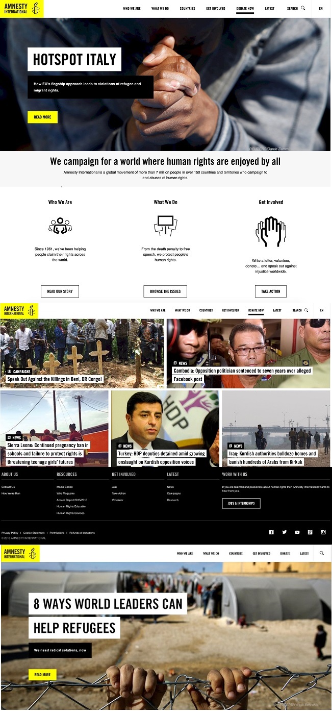
Amnesty international is a great example for a charity that has perfected its use of imagery. Every image tells a story and there is a clever interplay between image and headline. Note how this site puts the emphasis on the words rather than the technology, here the lack of movement is striking. This creates a really confident, clear message and every aspect of it is considered and assertive.
Your charity’s donation funnel
Charities today are starting to reap the benefits of online fundraising. If this is one of the goals of your site, this section is especially important and small changes can have a big impact on donations made to your cause.
Once you have effectively engaged with your user upon first impact, the journey through to a donation begins. Here are the questions you need to ask yourself:
* Do you have clear calls to action on every page?
* Are you focusing on leading your users primarily to the area of greatest interest for you (donation page)?
* Do you have an FAQ area to assist users who might have questions or concerns?
* Is your donation form optimised to ensure users aren’t dropping off before they complete the donation?
* If using anchors for the suggested donation amount, are you using the right ones?
* Are you ensuring your users can donate on a variety of devices and giving a variety of secure payment options (PayPal etc)?
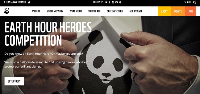
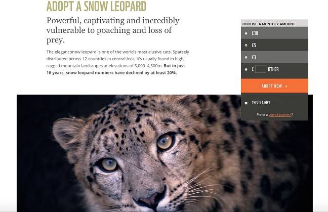
The WWF is a fantastic example of a website geared towards fundraising. The three multi-coloured buttons visible on the right hand side are actually all ways to support WWF – By donating in a conventional way, by joining WWF as a member, or by ‘adopting’ an animal.
On the ‘adoption’ page, there are suggested monthly amounts (these are all recurring donations, a great way to fundraise effectively). There is also an option to ‘gift’ the donation to someone.
Putting it all together
It is apparent from the examples above that these different aspects of your charity website go hand in hand. Optimising your website, from your headlines and imagery down to your donation funnel, will create an engaging and seamless experience for your users, more likely to rally their support and ultimately lead to them donating to your cause.
Needless to say your website should also be up to date with the latest security updates (especially when fundraising) and technology advancements (automatically rendering to different screen sizes, linking to your social media platforms and integrated with the most popular payment platforms to name a few).
A periodical review of your site will ensure that your website is optimised for your site users and will flag any issues that should be dealt with or any areas for improvement.
Sahar Dolev-Blitental looks after marketing at Pedalo Web Design . Pedalo is a full service web design and development agency based in central London, catering to charities and not-for-profit organisations for over 15 years. @pedalowebdesign


