You’ve got supporters clicking through to your landing page, now how can you ensure they complete their donation? Here are 7 tips to help you get the best results
By Mandy Johnson
It can happen to the best of us. You’ve spent time engaging your target market, getting to know them, understanding what will motivate them to give to your charity, and you have created the perfect digital activity to drive them to your website. But when they reach the webpage you have directed them to, the donation rate is far lower than you had hoped.
In this post, I am going to share with you how the design of your landing page can greatly impact your results, and what you can do to maximise your chances of success.
What is a landing page?
Corey Wainwright, Director of Content at HubSpot, describes a landing page as “any page on the web on which one might land that 1) has a form and 2) exists solely to capture a visitor's information through that form.”
The poignant word in Wainwright’s definition is “solely”. An effective landing page has one purpose and one purpose only: to drive a single action from your supporters.
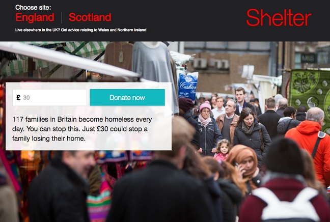
The information captured by a landing page could be anything from a signature on a petition to a donor’s payment details. You can see an example of a landing page from Shelter to the right. In this example, Shelter is asking its supporters to make a donation. This page gives the supporter a focused place to do nothing but donate.
Why are landing pages important?
If your charity only informs its supporters about one thing at a time, then there would be no need for a specific landing page; your website would be one page solely talking about that subject. However, I have never seen an organisation that only has one thing to say. Most charities run multiple campaigns at the same time. You will be promoting an event while also seeking more volunteers, asking them to write to their MP and also wanting people to sign up for a regular gift. It is perfectly legitimate to ask different audiences for all of these things at the same time. Creating dedicated landing pages for each call to action allows you to manage the supporter journey that drives them to take the appropriate action.
The business case for optimising your landing pages
By making small changes to optimise your landing pages, you can dramatically increase the completion rate of your forms, leading to more volunteers, more campaign actions taken and/or more money raised.
According to M R’s annual benchmark report the average conversion rate of a charity’s dedicated donation page is only 15%. This means that, on average, 85% of people visiting a donation page do not donate. If you are already achieving a 15% conversion or above, then well done but there is no reason that you cannot seek even better results. In theory, 100% of people landing on your page could complete the action you have requested from them.
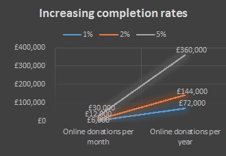
If we look at the graph opposite, you will see how very small changes in the completion rate can lead to a very large increase in the income raised for your charity. In this example, increasing the rate by just 5% could achieve an additional £360,000 for your charity. In fact, the British Heart Foundation found that creating and optimising a dedicated landing page for their furniture collections led to an additional £3m of income for the charity.
1. Focus your supporter’s attention
It is extremely important that the landing page you are sending your supporters to only allows them to complete the action that you have requested them to. Do not distract them with competing calls to action. This may seem obvious but it is easy to let other calls to action sneak onto pages without realising. This can confuse or divert your supporters from what they originally came to the page to do.
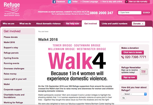
You can see an example of this happening on Refuge’s website (opposite). This is the landing page for their fundraising event, Walk4. It is a great event with a strong link to the cause but the page is forcing it to compete with three other calls to action; the charity is also giving its supporters the option to make a donation, sign up to the newsletter and share how they heard about Refuge. These are all important calls to action but they distract the supporter from what they came to the landing page to do; sign up for Walk4.
2. Put the action above the fold
The form that you want your supporters to complete needs to be visible in the upper half of the web page without them having to scroll down. This space is often known as “above the fold”. Anything “below the fold” can easily be missed by your supporters. Make sure the vital actions are the first thing they see. If we look at the example from Refuge above, the three buttons that their supporters can click on are unrelated to the event they are asking people to sign up for and their supporters have to scroll down to click another button to sign up for Walk4.
3. Only include vital fields
It is easy to get greedy with the amount of information that we would like supporters to tell us about themselves. The more we know, the better we can target our communications in the future. However, the more information that you ask them to complete, the less likely they are to complete the form you need them to. Ask yourself whether every field on the form is 100% vital or necessary and, if it’s not, get rid of it. You can always collect more data at a later date but you may only get one chance to get that supporter to complete the action you want them to.
4. Make sure the page is mobile friendly
Your entire website needs to be mobile friendly otherwise you are wasting the traffic that you are driving to it. Internet usage on mobiles overtook desktop computers over two years ago…need I say more?

5. Include a visual and written reason for your supporters to complete the action
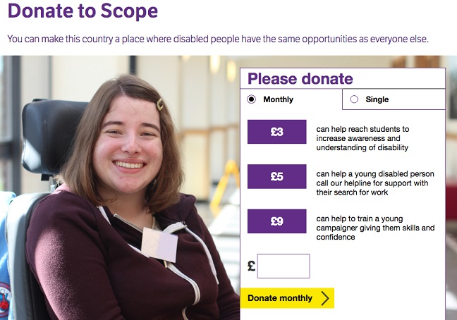
While the first thing that your supporters should see is the form that you want them to complete, it is useful to include the reason(s) that they should take the call to action somewhere close by. You can see a nice example of this opposite from Scope. Scope gives supporters a “shopping list” of what their donation could fund along with a nice image. It is worth remembering that some people need visuals to bring things to life whilst other people respond better to facts and figures that are written down; make sure you cater for both.
6. Test, test and test again
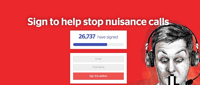
It is only through testing how supporters respond to a page that you will learn what works and what doesn’t. Make sure that you look at every button, every image and every piece of copy as something that could be changed and test different iterations against each other to find out which works best. The consumer rights charity Which? is excellent at this. The image opposite shows a bespoke landing page that they created which achieved a conversion rate that was 42% higher compared to the same call to action they ran on their website with more text and a competing ask on the same page.
7. Remember - your “go live” date is not your completion date
When you finally release your page to the public it would be easy to think that your work is done however sadly this is not the case. As soon as your page launches you will start obtaining data that will help you optimise your page further. You will be able to see how many people start the form and get to the very end and you can test how different iterations impact your results. Your “go live” date is the start of your live testing.
In summary, if you are asking your supporters to do anything online, it is vital that you invest time and resource into the landing page you are driving them to. Remember that small, data-driven changes can make a big difference to the outcome and potentially help you raise thousands more. I look forward to seeing what you create.
Mandy Johnson @MsMandyJ is director of partnerships at Change.org


